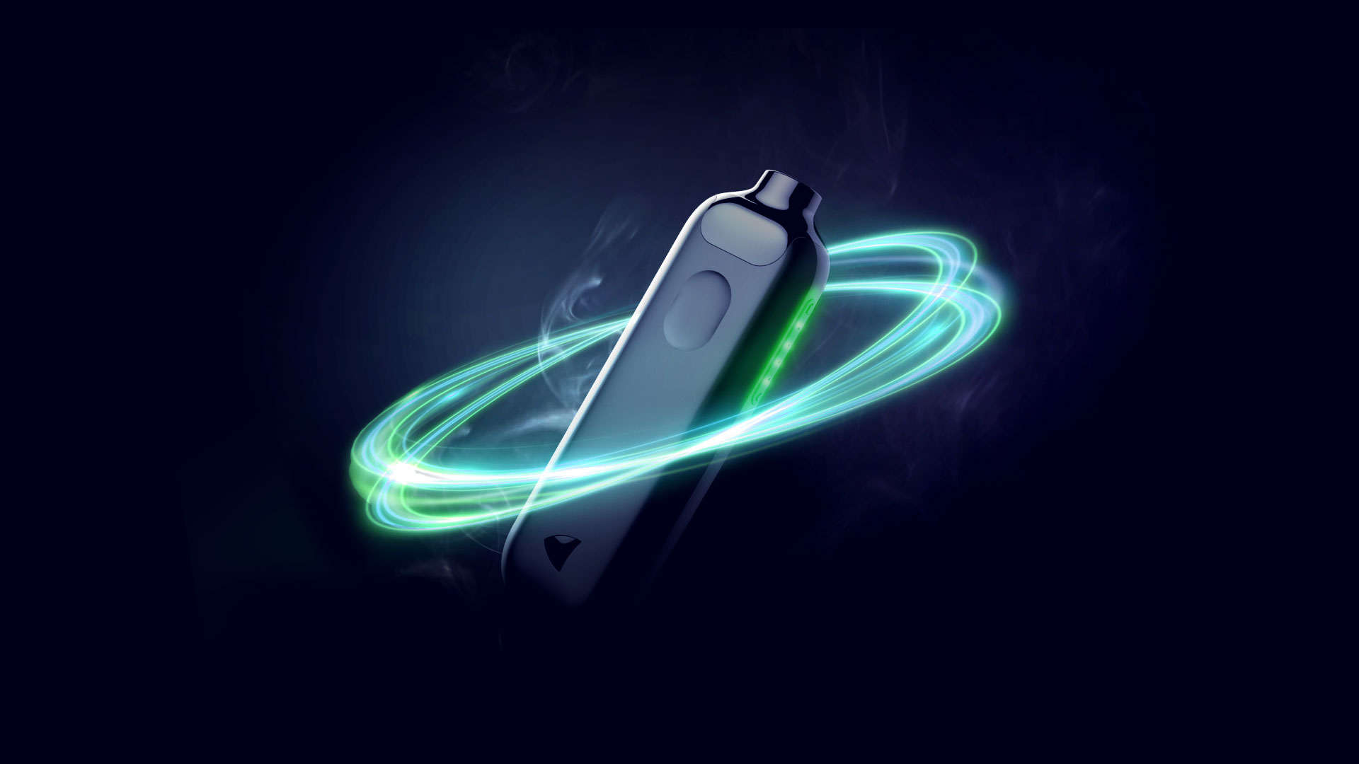
At Digitas Health, I worked as a product designer on Nicorette: an iOS and Android app paired with a connected device to support people through their smoking-cessation journey. I supported strategy and led design and build with a team of five during a 32-week agile development programme.
Deliverables:
Research workshops and insights into quitting behaviours
Feature and journey recommendations
Product strategy and design exploration
UX flows, wireframes and working prototypes
Brand-aligned UI and reusable components
Design informed by user-testing results
Understanding the user
I created workshop materials and helped facilitate research and co-design sessions with people who wanted to quit smoking or stay smoke-free. Working alongside the wider team, I translated what we learned into design decisions, shaping the app’s features, user flows and interface around the needs participants shared.
A custom quit journey
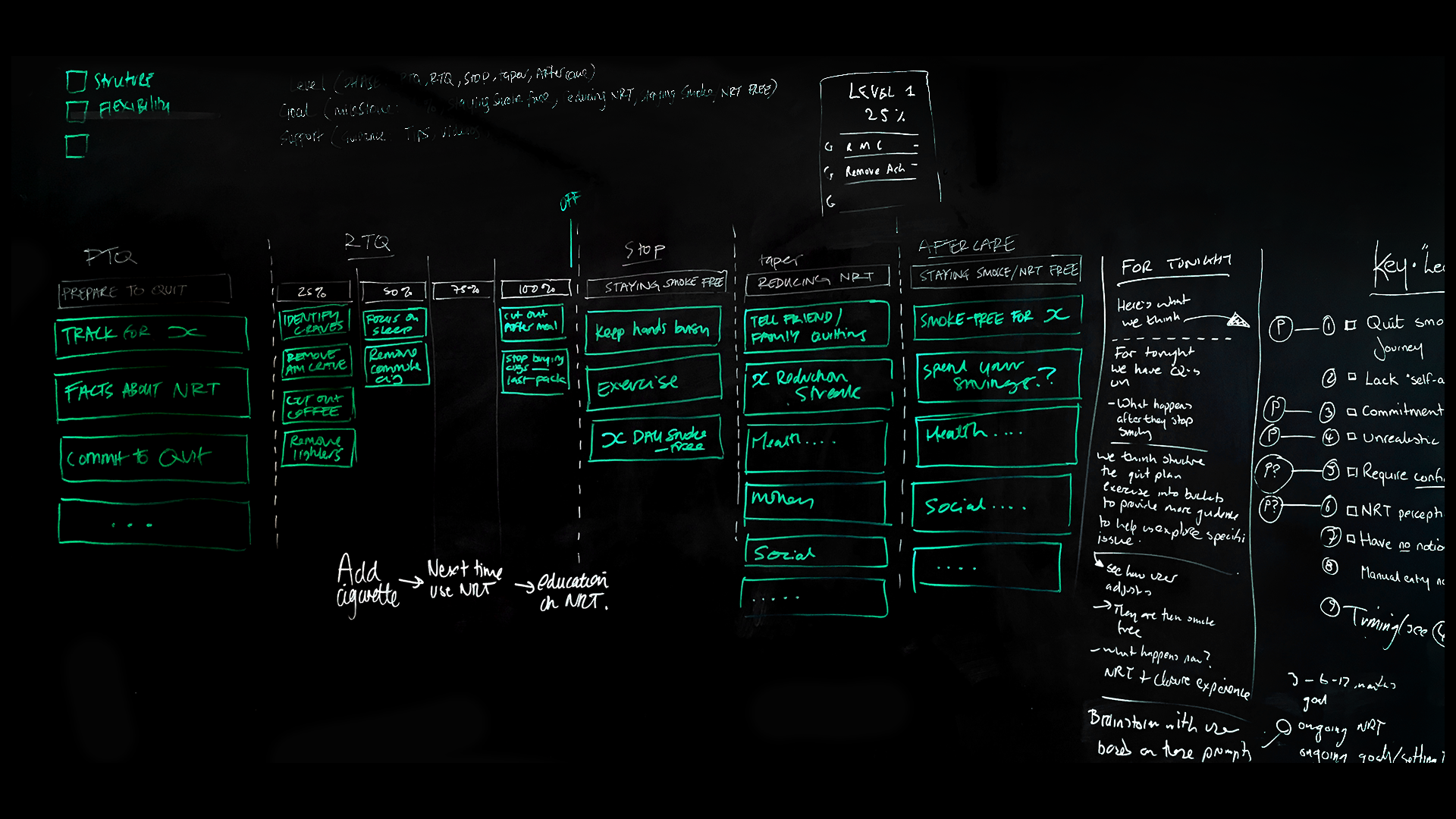
We mapped each participant’s previous quit attempts to understand how their experience unfolded over time: what motivated them to start, where they struggled and what support they found useful. Looking across these individual journeys gave us a broader picture of the challenges people faced.
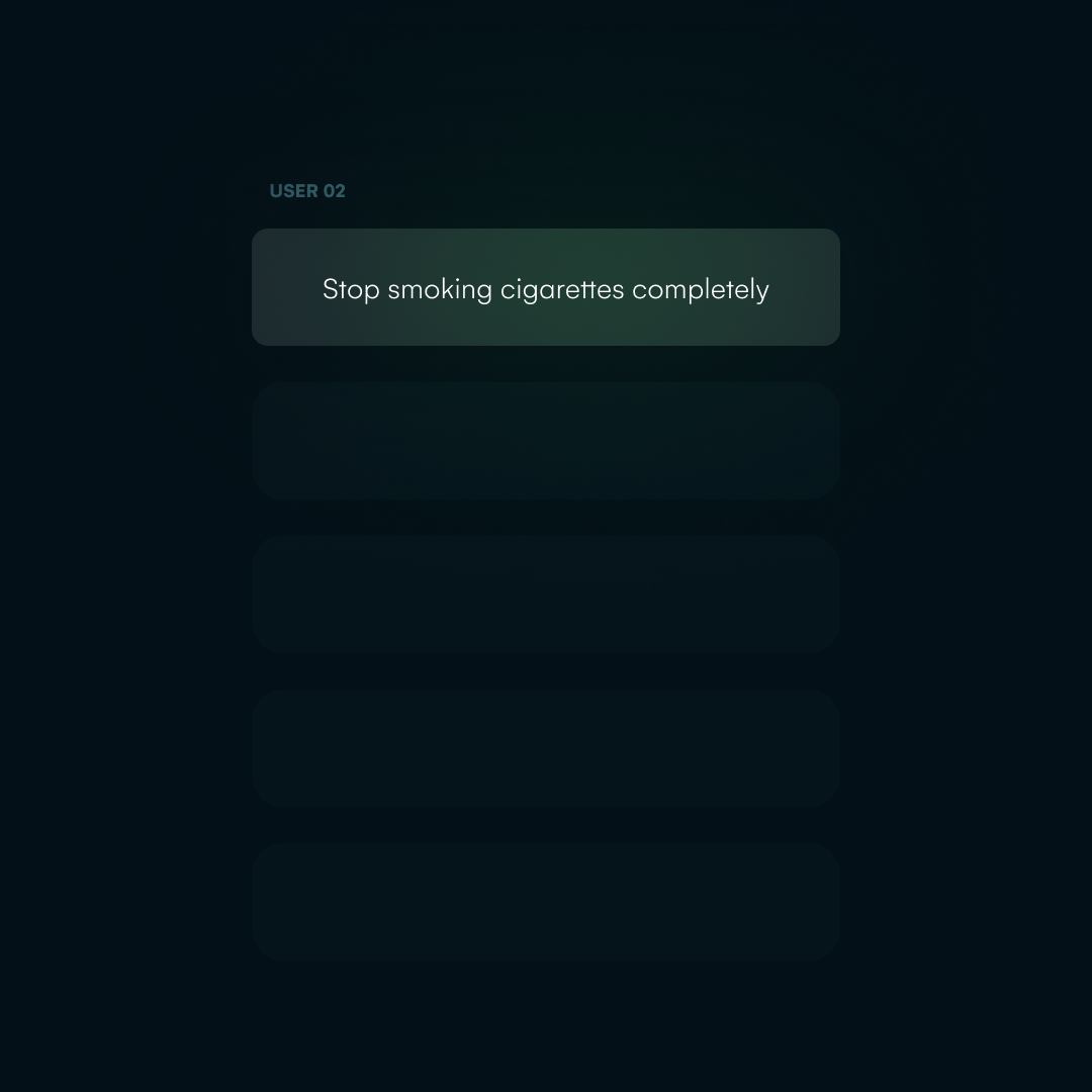
By comparing the maps, we could identify recurring needs and common points of difficulty while recognising where experiences differed. This helped us prioritise support that could be useful to a wider range of people, while leaving room for a journey that reflected individual goals and circumstances.
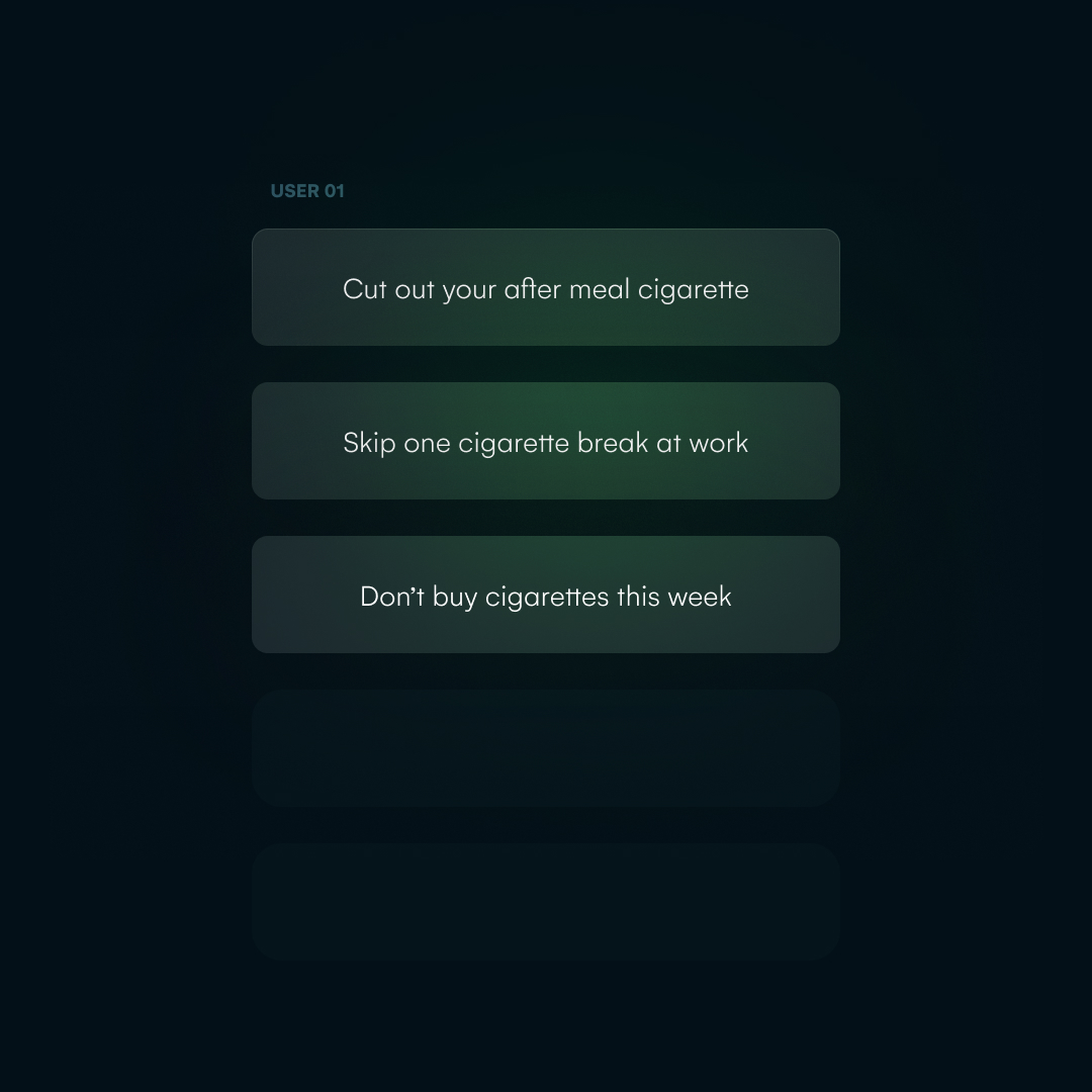
Small steps, big changes!
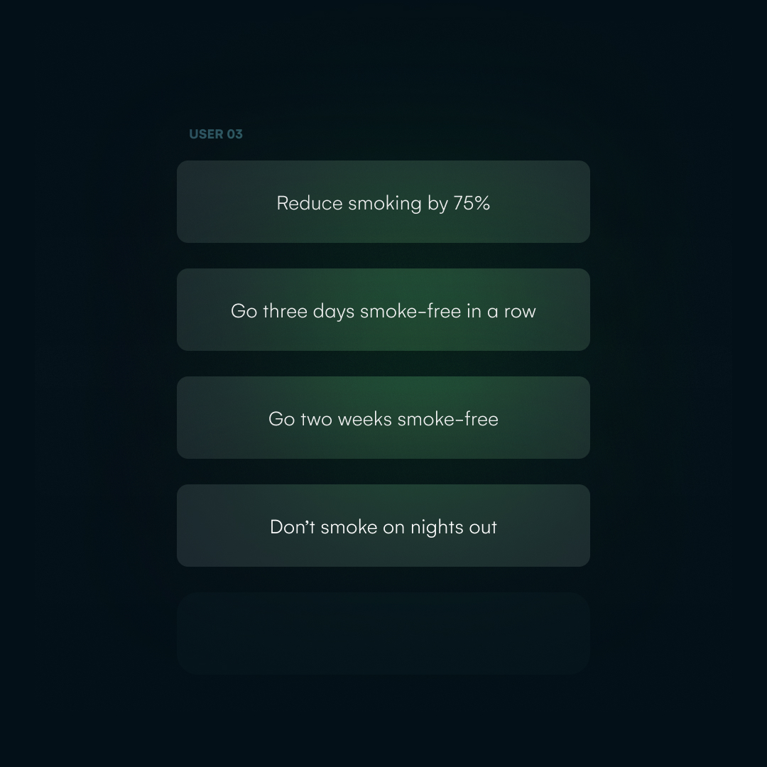
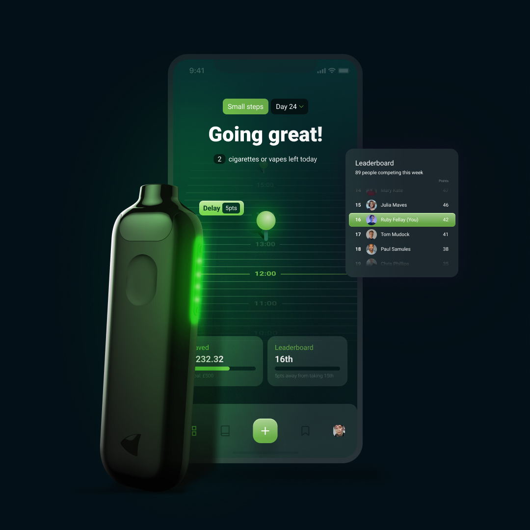
Gamification translated the quit journey into smaller, achievable goals. Milestones and rewards made progress visible, recognising the everyday actions that contributed to a bigger change.
These moments of encouragement supported the behavioural-change strategies built into the journey: setting goals, recognising progress and reinforcing positive actions.
UX
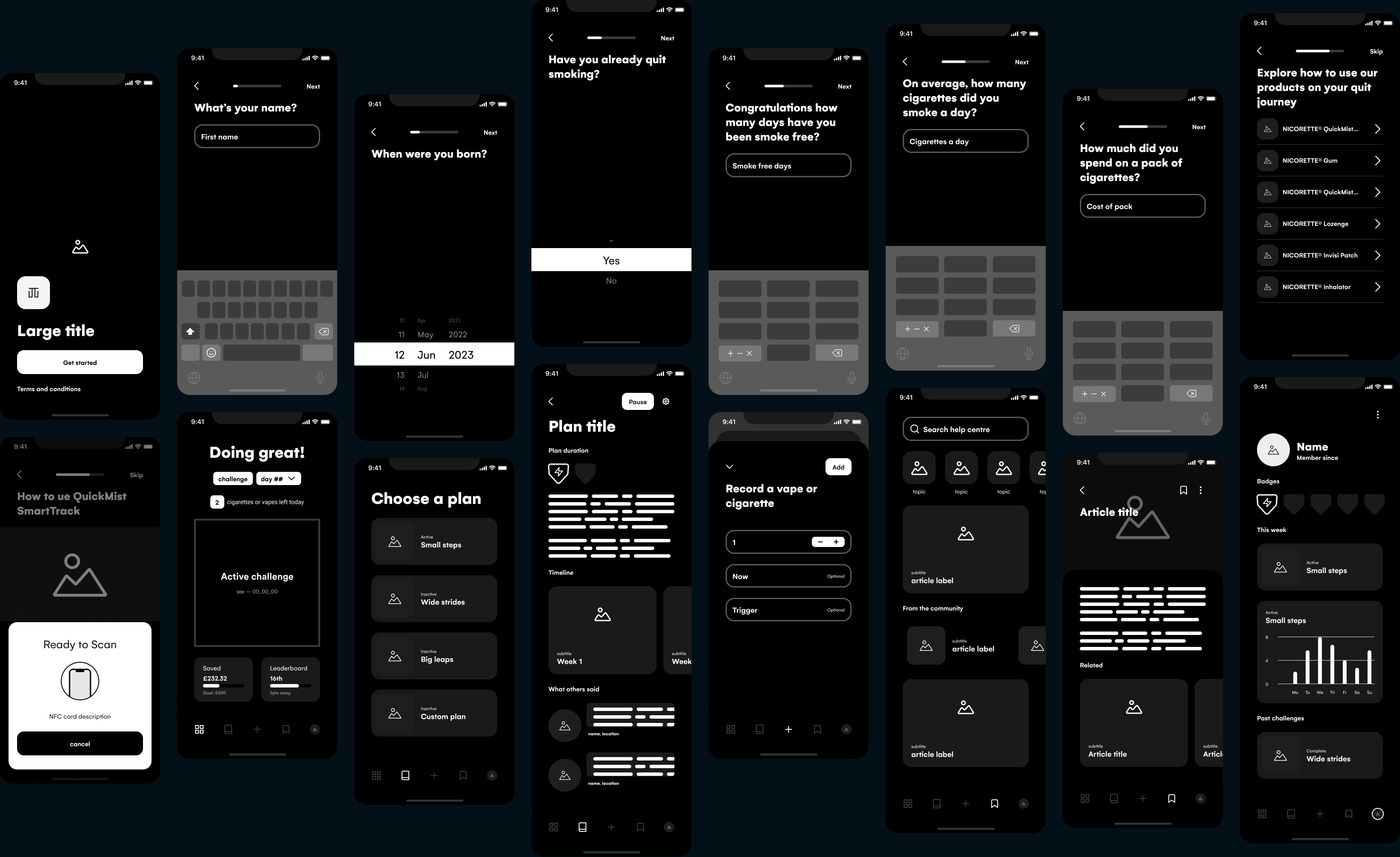
I designed the quit journey flows in short, intensive sprints, prototyping and presenting UX to the client every couple of days. Focusing each prototype on key decisions, with realistic interface copy, helped me gather useful feedback early and quickly iterate.
UI
I designed and packaged the views and components for the in-house development team, following atomic design principles to build reusable components into complete interfaces. In Figma, views were clearly labelled, organised around our epic naming convention and built with Auto Layout, making the handover easy to navigate.
Each delivery included working prototypes, animated examples for interactions beyond Figma’s capabilities, and PDFs documenting each journey and sprint. Together, these gave the team a clear reference for how the interface should look and behave.